
THIMGAN HAYDEN’S BLOG
Tag
- Arnold Bocklin 1
- Art Residency 1
- Artegiro 1
- Artsy Life Community 1
- Autumn 1
- Beauty in Art 1
- Big Magic 1
- Books 2
- Calcium Carbonate 1
- Catholic Bishop 1
- Cezanne 2
- Commissions 1
- Georgette Heyer 1
- How-to Video 1
- I Capture the Castle 1
- Inness 1
- Island of the Dead 1
- Italy 3
- Michigan plein-air 2
- Montefiascone 1
- Night Landscapes 1
- Open Studio Plans 1
- PICCOLOs 1
- Painting in Florence 1
- Pierce Cedar Creek Institute 1
- Poetry 2
- Portrait Projects 4
- Pre-Raphaelites 1
- Provence 1
- Rebecca Harp 1
- Vanessa Bell 1
- Watercolor 1
- Why Collect Art? 2
- William Nicholson 1
- about me 1
- about prints 1
- art and life 1
- art business 3
- art trips 2
- black mirror 1
- books 1
- canvas 1
- classical motifs 1
- collecting art 1
- creativity 3
- fall 1
- favorite painters 4
- floral 3
- florals 2
- giclee 1


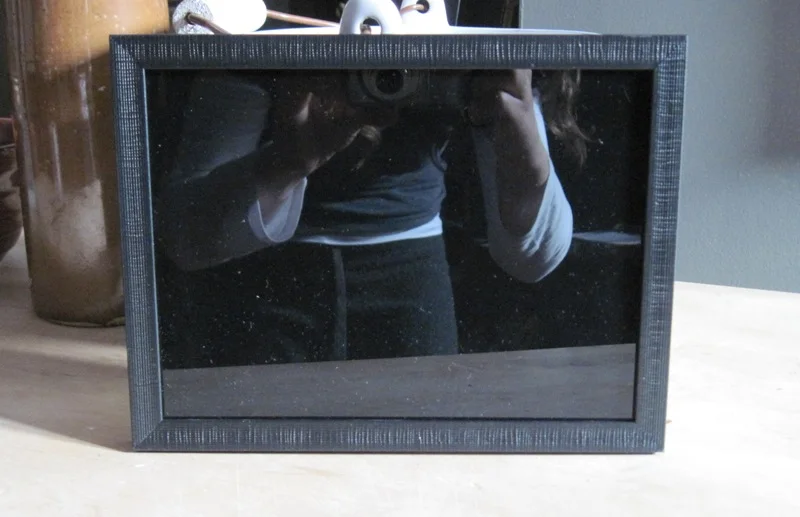
Black Mirror For Painters
Using a black mirror demo video IS HERE!
Below are simple instructions on how to make a cheap one. You’ll need one before you can use one:).

Varnishing Oil Paintings
Anyone who's done any research quickly learns that there are some structural problems that can happen when oil paintings are varnished before the three to six month drying time.
Of course, as artists that sell work, this is somewhat problematic. We don't necessarily like storing pieces for that long. Fortunately, times change. New studies and experiments happen. While I'm not a chemist or materials expert, I am a researcher-type and I'll share some art "street talk" about it here.

Canvas or Panel?
Looking for quick advice on how to choose a panel or canvas for oil painters? Read the post and click the blog post title to get to the video link.

Planning Artwork in a Series
Planning art in a series gives me an end goal and gives collectors a heads up on what pieces might be available in the next season.

Using Lead White in Oil Painting with Cadmium Colors
Old masters' oil painting techniques fawn over the creamy, textural properties of white paint that contains lead. It dries quickly, has dreamy body (yes, still talking about oil paint), and has a certain warm silver cast to the color that adds an old master's look to your work. I was taught to be afraid of the paint interacting with other, synthetic paints, like cadmiums, but...

Lead (Cremnitz) White in Oil Painting and Substitutes
Updated April 2023!
Thoughts on why lead white paint is so useful, how you can handle it more safely and what are your options.