THIMGAN HAYDEN’S BLOG
Tag
- Arnold Bocklin 1
- Art Residency 1
- Artegiro 1
- Artsy Life Community 1
- Autumn 1
- Beauty in Art 1
- Big Magic 1
- Books 2
- Calcium Carbonate 1
- Catholic Bishop 1
- Cezanne 2
- Commissions 1
- Georgette Heyer 1
- How-to Video 1
- I Capture the Castle 1
- Inness 1
- Island of the Dead 1
- Italy 3
- Michigan plein-air 2
- Montefiascone 1
- Night Landscapes 1
- Open Studio Plans 1
- PICCOLOs 1
- Painting in Florence 1
- Pierce Cedar Creek Institute 1
- Poetry 2
- Portrait Projects 4
- Pre-Raphaelites 1
- Provence 1
- Rebecca Harp 1
- Vanessa Bell 1
- Watercolor 1
- Why Collect Art? 2
- William Nicholson 1
- about me 1
- about prints 1
- art and life 1
- art business 3
- art trips 2
- black mirror 1
- books 1
- canvas 1
- classical motifs 1
- collecting art 1
- creativity 3
- fall 1
- favorite painters 4
- floral 3
- florals 2
- giclee 1
Thimgan Discovers Vanessa Bell
I have apparently been living under a blanket of ignorance, for it was only today that I discovered the art of Vanessa (Stephen) Bell, older sister to Virginia (Stephen) Woolf.
Sort of like those YouTube reaction muckbang vids or the ones where we watch a musician listen and emote to a popular song or artist that they’ve sheepishly admitted to never having tried, I enjoy watching myself sort through what grabs me about this new-to-me artist whom I should have known about.

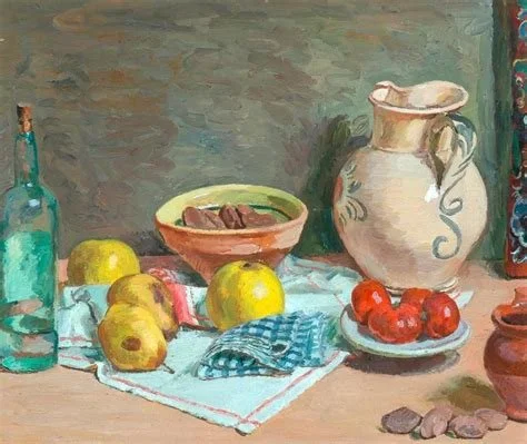
Meet My Inspired by Cezanne Collection!
These qualities are what I find charming about Cezanne's work. If you've hung around with me a while, you'll know Cezanne is one of the artists that I don't call a favorite, yet I'm fascinated by the fact that I can stare at his paintings like a hungry person. Why?

The Visitor
“The coming of a person
is, in fact, a tremendous feat.
Because they
come with their past and present
and
with their future.”

Blinded by Emotion: Can Visual Art Express Such a Thing?
I have a thread of blindness running through the years of my life.
This morning I determined that my preoccupation with seeing (which results in painting, among other activities) but not understanding (a wee bit of what we now call autism, maybe?) results in a kind of sightlessness that has lived within my shadow side as long as I can remember.

"I Worried" a Poem by Mary Oliver
… I saw that worrying had come to nothing.
And I gave it up. And took my old body
and went out into the morning,
and sang. -Mary Oliver
What’s the difference between an original, print, reproduction and giclee?
What’s a giclee? A giclee (pronounced ‘zhee-clay, it’s French) is an archival quality reproduction or print.
Giclees use ink printing machines instead of toner. It’s a more expensive process, but often yields richer, more nuanced color that may match the original art better.


Spring Whispers in the Wind: the art of spring
Spring whispers in the wind
Stirs among the boughs
Wakes the tender buds with its call.

Beauty and Bocklin
As humans we aren’t always in the mood for beauty, and that’s totally a valid state of mind. It doesn’t mean beauty is no more. I think Beauty meets us in our deepest moments… it folds us entirely, including our pain and want, in its gentle arms and rocks us back and forth as a loving mother might.

All Through the Night: A Painting and Welsh Winter/Christmas Song
Soft the drowsy hours are creeping,
Hill and vale in slumber sleeping,
I my loving vigil keeping,
All through the night.


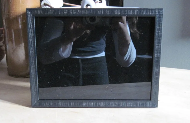
Black Mirror For Painters
Using a black mirror demo video IS HERE!
Below are simple instructions on how to make a cheap one. You’ll need one before you can use one:).

My Georgette Heyer Project
I started on this project because I’m a Heyer fan myself. It was my mom’s idea to do some paintings of Heyer, because she wanted to hang one as inspiration above the table where she (my mom) writes and figured other fans might as well. We both wanted a painting that felt vintage and was pleasing as art, yet recognizable as a portrait of Heyer.

Commissioned Paintings on the Easel
Commissioned painting of Christ of the Sacred Heart and English author, georgette Heyer.

What's the Story Behind Thimgan’s Art?
I enjoy reading about the lives of artists and finding interesting intersections in their lives and social circles. Take the Pre-Raphaelites or Impressionists (any school of art) and we discover painters, sculptors, poets, writers and musicians who mingled and influenced one another.
By owning a Thimgan Hayden original, you are participating in an art lineage, a provenance story, that will outlive us both.

What Every Painter Wants
In this case, Leeanne Seaver (Wonder Woman of word and camera) is a dear friend and wrote this beautiful blog post, the sky inside, linked about the making and new life of her Scottish gloaming painting, ‘Wolfy’s Sunset’.
if you’re as fascinated as I am with the powerful relationships that can happen because of art and how creativity can knit us together, then please jump to Leeanne’s blog post. You’ll enjoy it. But do me a favor and pretend I’m not wearing Crocs.

The Simple Guide to Art Collecting
Original art will outlive both the collector and the maker. Since the dawn of time, people have had the compulsion to create art and organize their life experiences into “story” through pictures, poetry, music, and a variety of narrative forms. I’ve stood in front of pieces and wept unexpectedly….

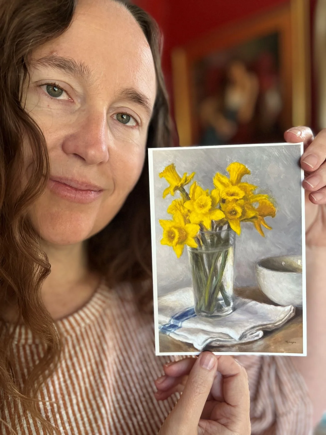
May Newsletter on the Blog and Video "meet the paintings"
A video of some recent paintings is here!